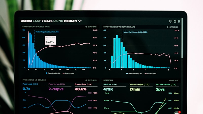
Data Sitting in a Database Is Inert. Data Visualized on a Dashboard Drives Decisions.
Data visualization transforms raw numbers into visual patterns the human brain processes 60,000x faster than text according to MIT research. Well-designed dashboards surface insights, identify trends, and enable faster, better decisions. According to Dresner Advisory Services, companies using data visualization tools are 28% more likely to find timely, actionable information than those relying on spreadsheets and static reports.
At x13apps, we design and build data dashboards for our clients. Here is the framework.
Dashboard Design Principles
Start with the audience and their decisions. An executive dashboard needs high-level KPIs and trends; operational dashboards need granular, real-time data for daily decisions; analytical dashboards need interactivity for deep exploration. Each dashboard should answer specific business questions, not display every possible metric. The most common dashboard mistake: too much information obscuring what matters.
Edward Tufte data-ink ratio principle: maximize the proportion of ink used to display data versus non-data elements. Remove unnecessary gridlines, borders, decorations, and 3D effects. Use visual hierarchy: most important metrics top-left (where eyes naturally start), size and position communicate importance. Consistent color usage: one color for primary metrics, second color for comparisons, red only for alerts and negative trends. Use white space to group related information and reduce cognitive load.
Choosing the Right Metrics and Visualizations
KPIs should be: aligned with business objectives, clearly defined (everyone agrees on calculation), comparable (with benchmarks or targets), and actionable (seeing the number should suggest what to do). The KPI tree: top-level company metrics (revenue, profit, growth rate) branch into department metrics (conversion rate, customer acquisition cost, churn rate) to operational metrics (page load time, support ticket response time).
Choose visualization types for data type and message: line charts for trends over time, bar charts for comparisons between categories, pie charts rarely (humans judge area poorly; use bar charts instead), scatter plots for correlation between two variables, heat maps for patterns in large data tables, and gauges and big numbers for single KPIs. Visualization tools: Tableau (enterprise leader), Power BI (Microsoft ecosystem integration), Looker/Google Data Studio (Google ecosystem), and Metabase (open source, developer-friendly). At x13apps, we build dashboards that turn data into decisions. For more, read our data-driven decision making guide.