Vous ne pouvez pas améliorer ce que vous ne mesurez pas.
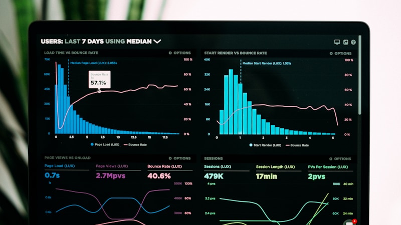
Un tableau de bord d'indicateurs clés de performance (KPI) vous donne une vue en temps réel de la santé de votre entreprise. Au lieu de vous connecter à plusieurs outils et feuilles de calcul, un seul tableau de bord affiche les mesures les plus importantes. Selon une étude réalisée en 2025 par Domo, les entreprises disposant de tableaux de bord exécutifs ont 58 % plus de chances d'atteindre leurs objectifs stratégiques, et les entreprises axées sur les données voient leur productivité augmenter de 5 à 6 %.
Chez x13apps, nous créons des tableaux de bord personnalisés qui aident les clients à prendre des décisions plus rapides et plus pertinentes. Voici comment en créer un qui génère des résultats.
Choisissez des KPI qui guident les décisions
Toutes les mesures ne méritent pas une place sur votre tableau de bord. Choisissez des KPI directement liés aux objectifs commerciaux et sur lesquels vous pouvez agir. Pour les entreprises de services : leads générés, taux de conversion, valeur moyenne du projet, coût d'acquisition client et revenu par employé. Pour le commerce électronique : trafic, taux de conversion, valeur moyenne des commandes, taux d'abandon de panier et valeur à vie du client.
Limitez votre tableau de bord à 5 à 10 KPI. Plus que cela, cela devient du bruit. Chaque KPI doit avoir une définition, une cible et un propriétaire clairs. Un KPI sans objectif n’est qu’un chiffre. Un KPI sans propriétaire n’est la responsabilité de personne. Examinez et mettez à jour votre sélection de KPI tous les trimestres à mesure que les priorités commerciales évoluent.
Sélectionnez le bon outil de tableau de bord
Google Looker Studio (anciennement Data Studio) est gratuit et se connecte à Google Analytics, Google Ads, Google Sheets et des centaines d'autres sources de données. Pour des besoins plus avancés, pensez à Tableau, Power BI ou à des outils spécialisés comme Klipfolio ou Geckoboard. Choisissez un outil que votre équipe utilisera réellement : un outil puissant que personne ne vérifie est moins utile qu'un simple outil vérifié quotidiennement.
Assurez-vous que vos sources de données sont exactes avant de créer le tableau de bord. Un tableau de bord affichant des données erronées est pire que pas de tableau de bord : cela conduit à de mauvaises décisions. Ajoutez des indicateurs de fraîcheur des données pour savoir quand chaque métrique a été mise à jour pour la dernière fois. Automatisez l'actualisation des données afin que votre tableau de bord affiche toujours les informations actuelles.
Conception pour la clarté et l'action
Organisez les KPI par catégorie : acquisition, engagement, conversion, rétention et finance. Utilisez des couleurs pour indiquer l'état : vert pour la cible, jaune pour la cible proche, rouge pour la cible en dessous. Ajoutez des flèches de tendance indiquant la direction au cours des 30 derniers jours. Gardez les visualisations simples : graphiques à barres pour les comparaisons, graphiques linéaires pour les tendances, chiffres uniques pour les indicateurs clés.
Examiner les tableaux de bord lors des réunions régulières
Un tableau de bord n’a de valeur que s’il stimule la discussion et l’action. Planifiez des réunions d'examen des KPI hebdomadaires ou bihebdomadaires. Examinez ce qui a changé, étudiez les écarts et décidez des actions. Attribuez des propriétaires à chaque élément d’action. Suivez si les actions ont fait bouger l’aiguille. Chez x13apps, nous construisons des tableaux de bord qui deviennent la pièce maîtresse des évaluations commerciales de nos clients. Pour en savoir plus sur l'analyse, lisez notreguide d'analyse Web.